In the hyper-competitive B2B SaaS landscape of 2026, marketing and sales teams are locked in a perpetual tug-of-war over lead volume and quality. Marketing drives traffic, sales complains that the leads are unqualified, and marketing responds by dumping more budget into top-of-funnel ad campaigns. The result? Stagnant demo request rates and a frustrated sales team.
The root of the problem often lies in a fundamental misunderstanding of the modern buyer’s journey. Far too many organizations treat the "Request a Demo" call-to-action (CTA) as a low-friction interaction, akin to downloading an e-book or signing up for a newsletter. In reality, booking a demo is a high-stakes commitment. It requires a prospect to surrender their anonymity, share personal contact details, and agree to enter a high-pressure sales conversation.
The Anatomy of a Mismatched Journey
According to the Dreamdata 2025 LinkedIn Ads Benchmark Report, the average B2B customer journey now spans 211 days and involves approximately 88 touchpoints. Buyers today are self-educating. By the time they arrive on your demo landing page, they have likely compared your solution against several competitors, read G2 reviews, and consumed extensive content.
If your landing page strategy is to treat every visitor as "demo-ready," you are ignoring the data. Only 3% to 5% of a typical market is in an active buying cycle at any given moment. When you push a demo request to a prospect who is still in the research or problem-identification phase, you aren’t just failing to convert them—you are actively creating friction.
The "Core Four" Strategy
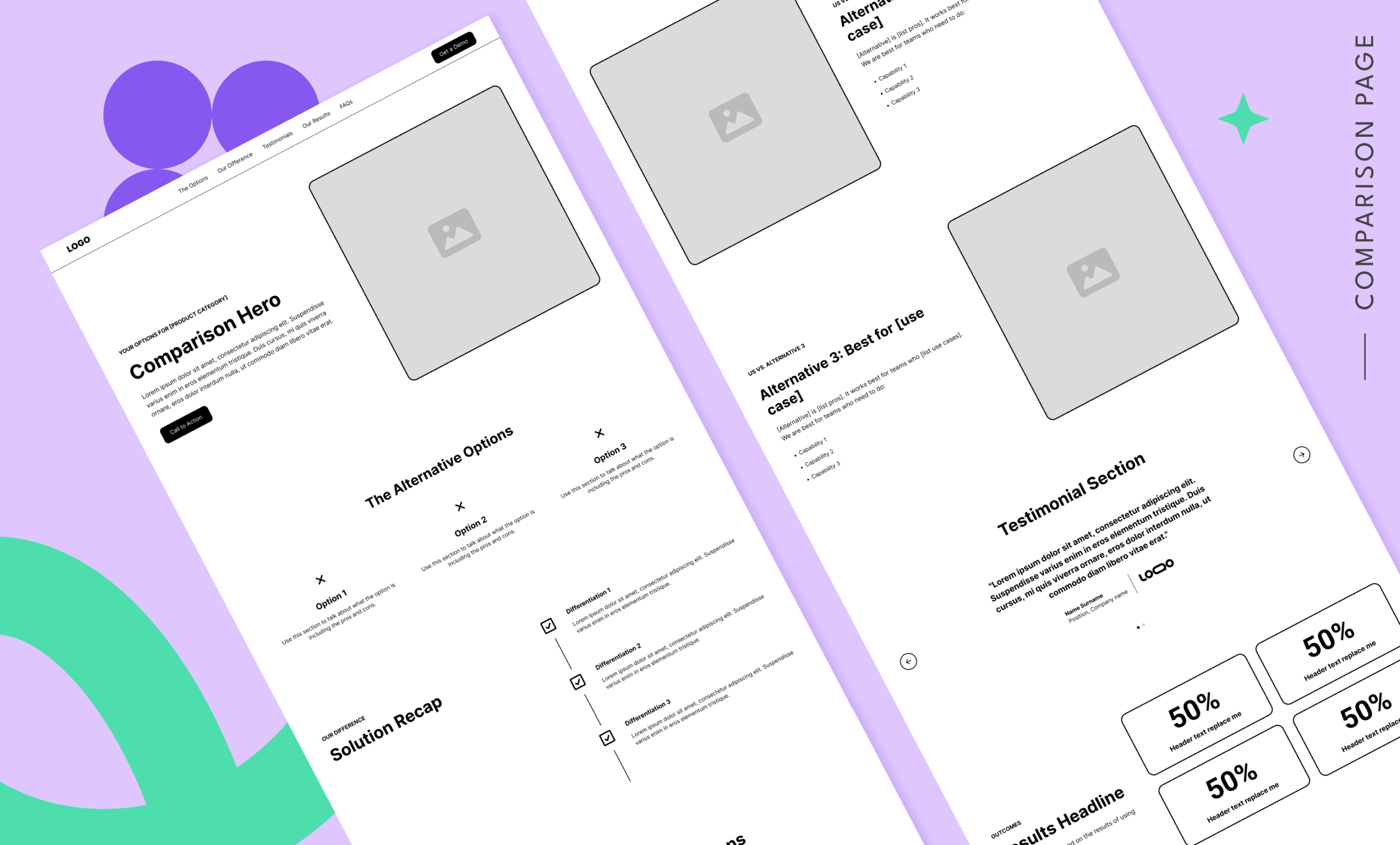
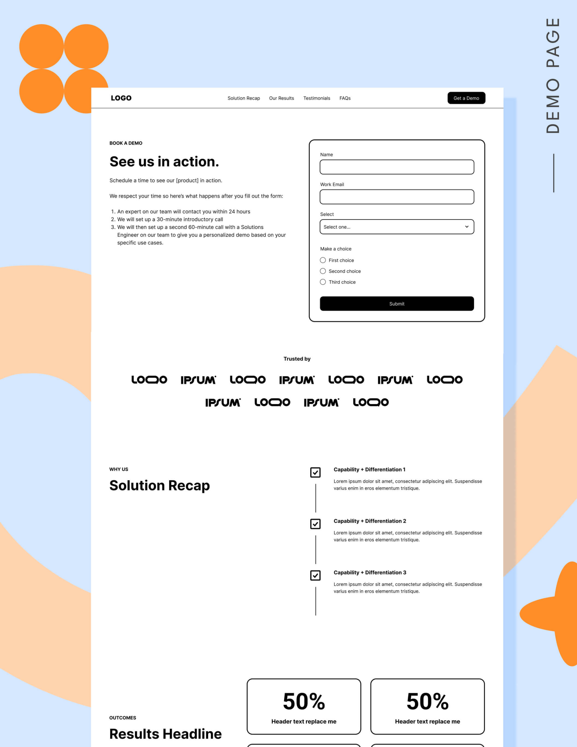
To bridge the gap between initial interest and the final purchase, experts like B2B strategist Tas Bober advocate for a "Core Four" landing page framework. This strategy recognizes that a buyer needs different information at different stages of the funnel.
- Top-of-Funnel (TOFU): Educational content that addresses the problem without pushing a sales pitch.
- Middle-of-Funnel (MOFU): Solution-oriented pages that compare your approach to others.
- Validation: Proof-based pages, such as case studies and white papers.
- Bottom-of-Funnel (BOFU): The demo landing page, reserved exclusively for the "warm" buyer who is ready to move forward.
Your demo landing page should not be an introductory brochure. It should be the final gatekeeper—a place to reinforce the decision that your solution belongs on their shortlist.
Supporting Data: Conversion Benchmarks and Realities
The median conversion rate for SaaS landing pages remains a modest 3.8%, according to Unbounce’s 2024 Conversion Benchmark Report. However, when focusing specifically on high-intent demo pages, expert data suggests a more realistic benchmark of 3.1%.
These numbers are often artificially depressed by poor traffic targeting. If you are running broad, cold-traffic ads to a demo page, you will inevitably hit a performance ceiling. No amount of A/B testing on button colors or headline copy will compensate for a visitor who isn’t ready to talk to a human. The goal is not to optimize for more traffic, but to optimize for better traffic.
The Seven Deadly Sins of Demo Landing Pages
If your demo requests are lagging, you are likely committing one or more of these common mistakes:
- The "Blind" CTA: Not telling the user what happens after they click "Submit."
- Form Overload: Requiring more than five fields, which historically causes a sharp drop in conversion.
- Lack of Navigation: Forcing users into a "convert or leave" trap, which Google’s current ad quality models now penalize.
- Generic Promises: Failing to address specific pain points or the "why us" factor.
- Inconsistent Messaging: A disconnect between the ad promise and the page reality.
- Missing Proof: An absence of social proof, testimonials, or logo gardens.
- No "Soft" Path: Providing no alternative for those who aren’t quite ready for a 1:1 sales call (like a webinar or interactive tour).
Constructing the Perfect Demo Page: A Block-by-Block Guide
To convert the warm, well-researched buyer, every element on your page must serve a purpose.

1. Strategic Navigation
While legacy advice suggested removing all navigation to force a conversion, modern SEO and user experience standards argue for a more holistic approach. Use an anchor-link navigation menu to help users jump to key sections, and a footer that links to other essential assets (like your "Why Us" or pricing pages). This keeps the buyer within your ecosystem rather than forcing them back to a search engine when they aren’t ready to book.
2. The Hero Section
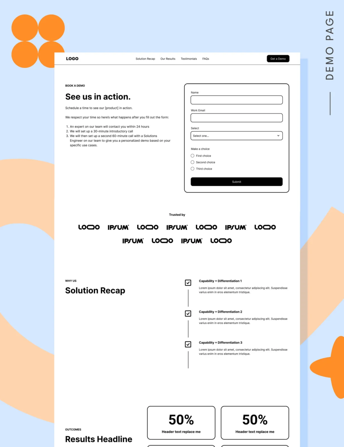
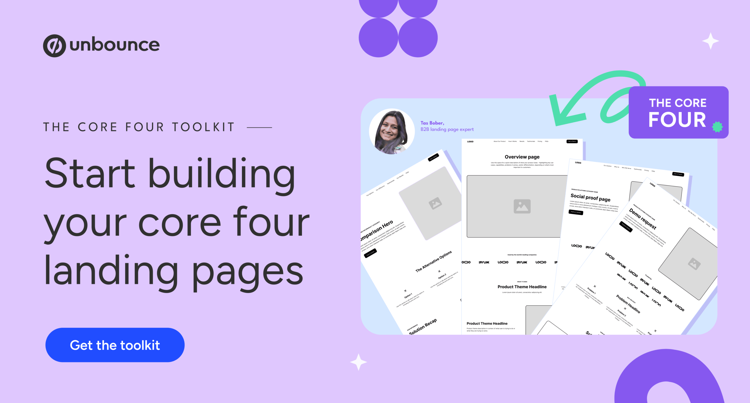
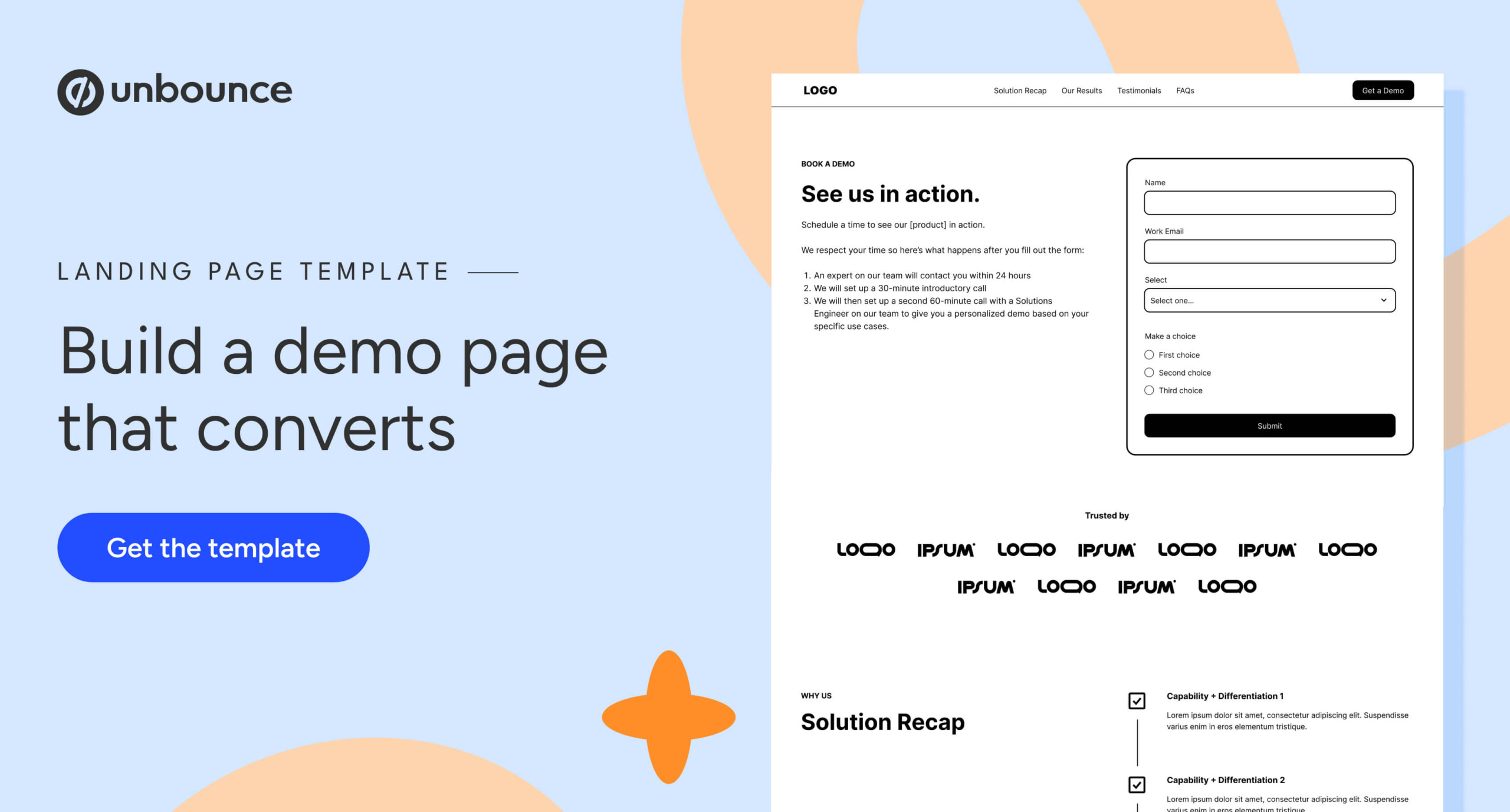
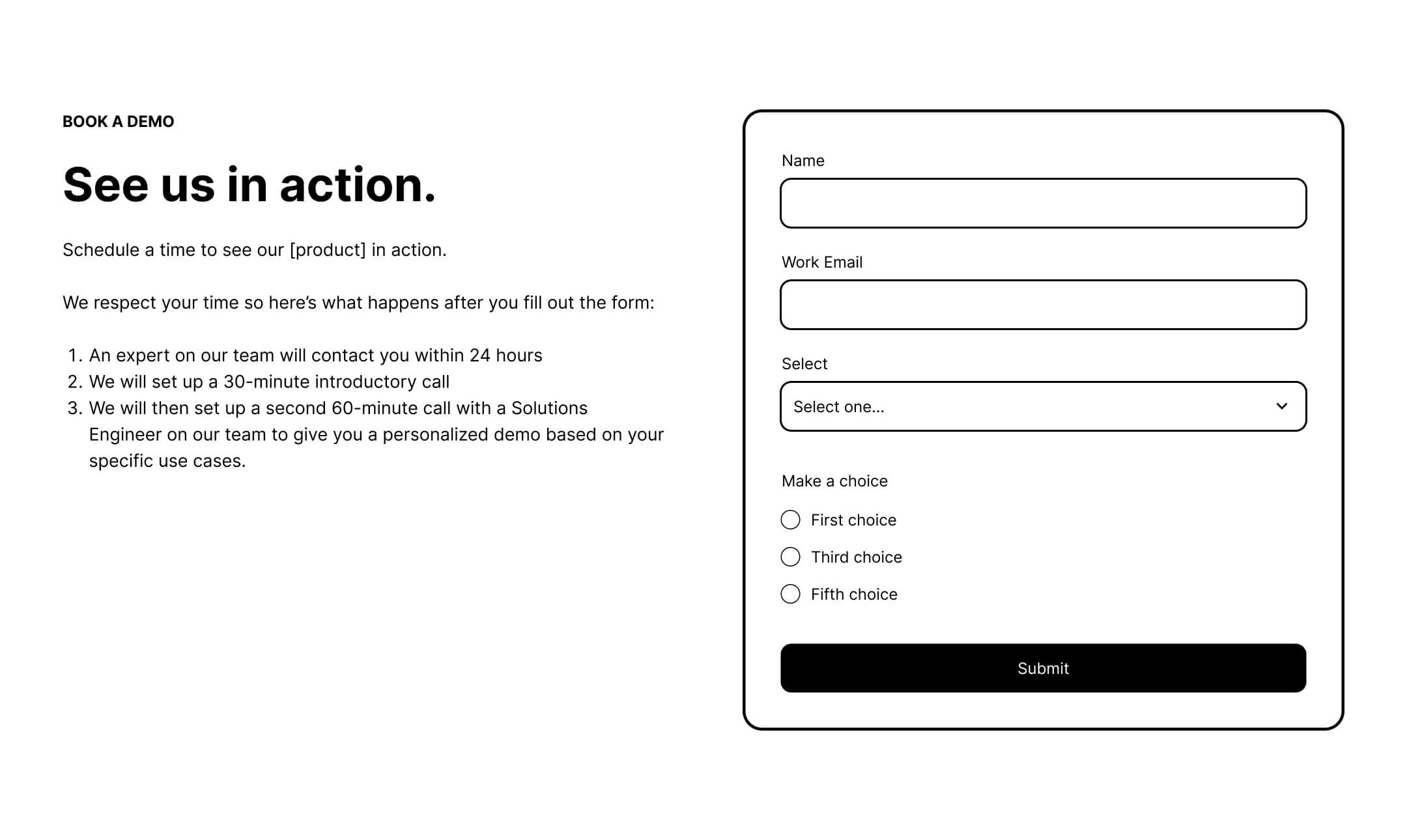
The hero is the only place on your site where placing the form "above the fold" is not just acceptable, but necessary. It must clearly articulate the value proposition and, crucially, set expectations for the demo process. Answer the question: What exactly am I signing up for?
3. Social Proof and Trust
A "logo garden" is essential for established brands. If you are a newer player, use high-quality testimonials—not just glowing praise, but specific, outcome-oriented quotes. Volume matters; aim for six to twelve testimonials to signal to the buyer that they are joining a community of satisfied peers.
4. The "Solution Recap" and Results
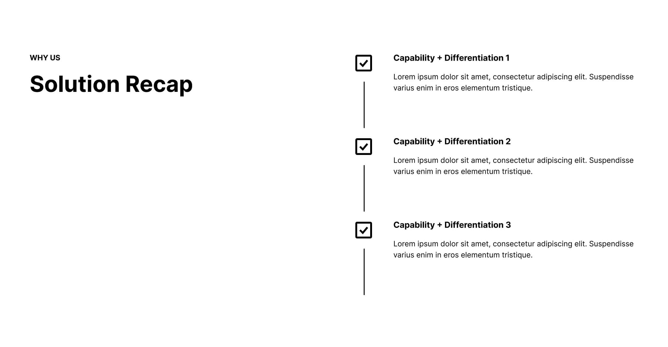
Reiterate your primary differentiator. Buyers are inundated with options; remind them briefly and clearly why your approach solves their specific problem better than the status quo. Back this up with quantitative results—metrics like "reduced churn by 20%" or "saved 15 hours a week" are far more powerful than vague adjectives.
5. Pricing Transparency
Even for sales-led organizations, there is a strong case for including a "starting at" price range. This acts as a powerful filter, weeding out low-budget leads who would have wasted your sales team’s time anyway, while building trust with those who are financially prepared.
The Case for "Positive Friction"
There is a temptation to make the "Request a Demo" process as easy as possible, but there is value in "positive friction." For example, including a brief qualifying question (such as "What is your primary use case?") can help your sales team prioritize high-value leads while signaling to the buyer that the demo will be a professional, tailored consultation rather than a generic sales pitch.
Furthermore, the shift from "Request a Demo" to "Take a Tour" has proven remarkably effective. Companies that incorporate interactive product tours have reported conversion increases of up to 33%, as it allows the buyer to experience the product immediately—a "try before you buy" approach that builds confidence before the final, high-friction commitment of a sales meeting.
Implications: Aligning Sales and Marketing
The ultimate implication of this data is that marketing and sales must operate as a single revenue team. If marketing is driving traffic that isn’t converting, they need to know why. If sales is failing to close the leads that are coming in, they need to tell marketing what they need from the landing page to better qualify the visitor.
The "Request a Demo" form is the final hurdle in a 200+ day journey. If you treat it with the care it deserves—by providing the right information, building genuine trust, and respecting the buyer’s stage in the decision-making process—you will find that your conversion rates aren’t just a number to be improved, but a reflection of a healthy, transparent, and high-performing sales pipeline.
Stop blaming your landing page for bad traffic. Fix the journey, guide the buyer, and the conversions will follow.