
In the high-stakes world of digital marketing, the line between a viral success and an overlooked advertisement often rests on a single, short phrase: the Call to Action (CTA). Whether you are driving traffic to an e-commerce storefront, soliciting newsletter sign-ups, or encouraging an app download, your CTA serves as the digital signpost guiding your audience toward their next move. Without a clear, compelling prompt, even the most beautifully designed campaign risks becoming "scroll-fodder"—content that users see, ignore, and forget in the blink of an eye.
What is a Call to Action?
At its core, a call to action is a strategic text prompt designed to inspire a specific behavior from a target audience. It is the bridge between passive consumption and active engagement. While often distilled into succinct commands like "Buy Now" or "Download Today," a sophisticated CTA can be a nuanced sentence, such as, "Subscribe today to ensure you never miss an update."
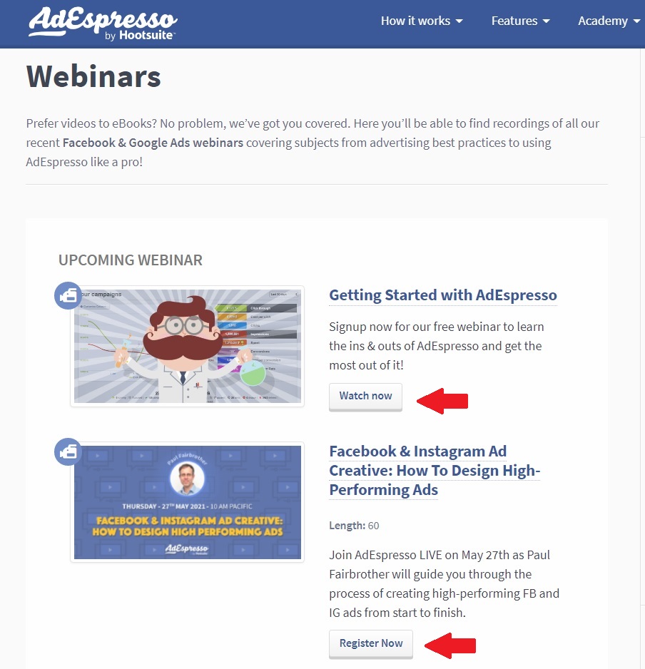
The utility of a well-crafted CTA extends beyond mere instruction. It acts as a remedy for "decision fatigue," a psychological state where consumers become overwhelmed by choice and, consequently, take no action at all. By providing clear, actionable direction, marketers add purpose to their content, ensuring that the user journey remains seamless and intentional.
Chronology of Evolution: From Simple Buttons to Strategic Drivers
The history of the CTA is tied to the evolution of the internet itself. In the early days of web design, CTAs were rudimentary—often just blue, underlined hyperlinks that said "Click Here." As the web matured, so did the psychology behind these prompts.
- The Primitive Era (1995–2005): Focus was placed on basic navigation. CTAs were functional but rarely persuasive, relying on the novelty of the internet to drive engagement.
- The Optimization Era (2006–2015): The rise of A/B testing and analytics allowed marketers to measure the efficacy of button colors, placement, and wording. This period birthed the data-driven approach to conversion rate optimization (CRO).
- The Personalization Era (2016–Present): Today, successful CTAs are highly personalized. Using AI and behavioral data, brands now serve dynamic CTAs that change based on user intent, past purchase history, and emotional triggers.
Supporting Data: Why Small Changes Drive Big Results
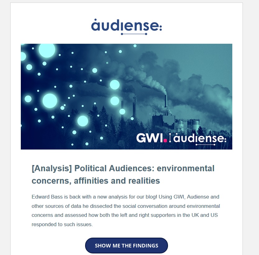
The impact of a refined CTA is not merely anecdotal; it is backed by significant empirical evidence. According to research from CXL, the integration of urgency-based CTAs consistently drives higher conversion rates. Furthermore, industry studies have shown that replacing plain-text links with visually distinct, clickable buttons can increase click-through rates by up to 83% in some environments.

A notable experiment conducted by AdEspresso illustrated the financial implications of poor CTA selection. In a $1,000 ad spend test, the company compared various CTA buttons. The top-performing button ("Download") resulted in conversions costing only $5.10 each. In contrast, ads running without a button at all saw costs jump to $12.50 per conversion. This data underscores a critical reality: failing to optimize your CTA is effectively the same as burning half of your marketing budget.

The Anatomy of an Effective CTA
Writing a high-converting CTA requires a balance of linguistic precision and psychological insight. To elevate your campaign, consider these three pillars:

1. Leverage Strong Action Verbs
Your CTA should start with a command that leaves no room for ambiguity. Depending on your business model, choose the appropriate verb:
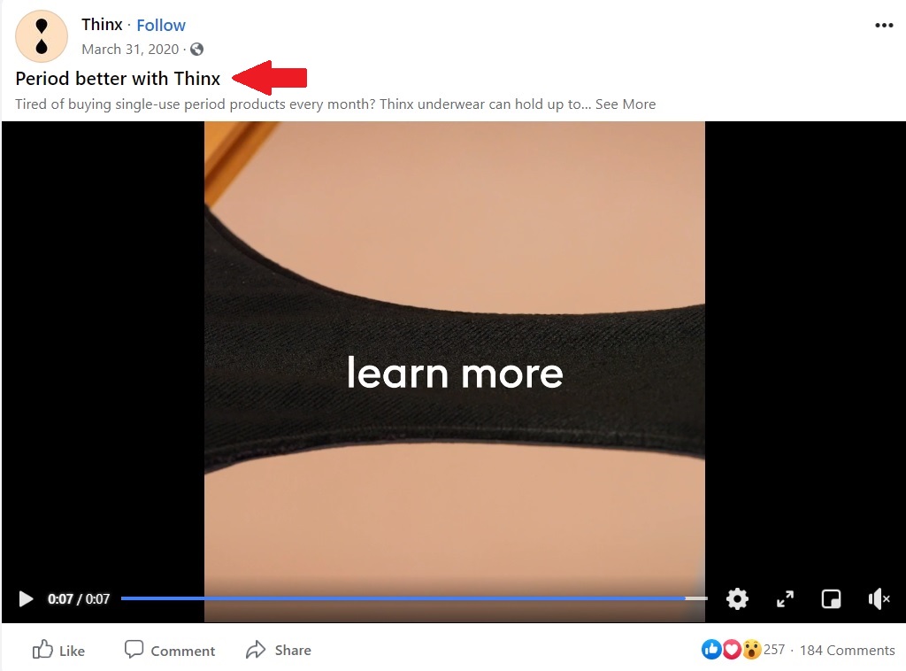
- Ecommerce: Buy, Shop, Order, Reserve, Save.
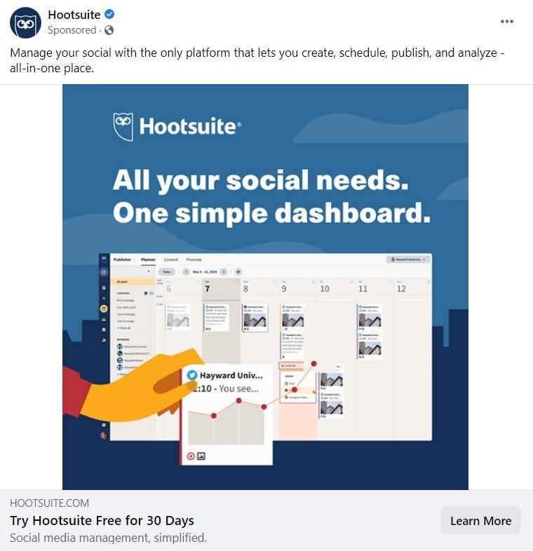
- SaaS: Try, Get Started, Subscribe, Sign Up.
- Non-Profit: Donate, Volunteer, Support, Give.
- General: Learn More, Find Out, Click Here.
2. The LIFT Model for Clarity
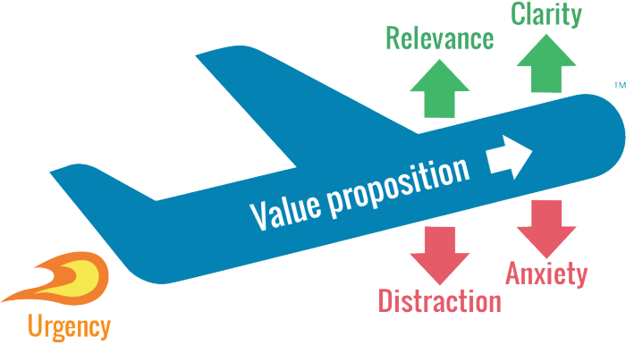
The LIFT Model—a framework used to evaluate landing page conversion factors—suggests that every CTA should offer a clear "Value Proposition." If your CTA is "Download," ask yourself: Is it relevant? Is it clear? Does it create urgency? A refined version like "Download your free guide now" is far more powerful because it combines the action with the reward.

3. Evoking Emotion
For more advanced campaigns, move beyond transactional language. Use sensory words that provoke a response. Instead of "Join our class," try "Start your creative journey today." This transforms the CTA from a chore into an invitation.

Official Industry Best Practices
Top-tier digital marketers follow specific protocols to ensure their CTAs perform across platforms:

- Prioritize Hierarchy: Use one primary CTA that stands out through color contrast. Secondary CTAs should be muted or placed further down the page to avoid conflicting with the main goal.
- A/B Testing is Mandatory: Never assume your first draft is your best. Run split tests on button color, copy length, and placement.
- Above the Fold: On websites, keep your primary CTA visible without requiring the user to scroll. This "hero" section should summarize the value proposition and provide an immediate point of entry.
Case Studies: Learning from the Masters
The Minimalist Approach: Tim Ferriss
Tim Ferriss’s email sign-up page is a masterclass in distraction-free design. By stripping away navigation menus and sidebar links, he forces the user to focus on a single choice: signing up. This extreme focus reduces friction, resulting in higher conversion rates.

The Sensory Hook: Headspace
Headspace utilizes sensory language in their social media ads, such as "Snuggle up to Headspace." By using a word that evokes a physical, cozy feeling, they differentiate their brand in a crowded market of meditation apps, creating an emotional bridge that a generic "Install Now" button could never build.

Strategic Urgency: Shaw Academy
In their Facebook advertising, Shaw Academy uses a "wall of urgency" strategy. By utilizing emojis, exclamation points, and multiple CTA buttons, they create a sense of excitement and time-sensitivity that compels users to act before the offer expires.
Implications for Your Marketing Strategy
The implication for businesses in 2024 and beyond is clear: you cannot afford to treat CTAs as an afterthought. As ad blockers become more prevalent and consumer attention spans continue to shrink, the "digital real estate" you own must be optimized for immediate action.

- The Cost of Inaction: A weak CTA directly inflates your Customer Acquisition Cost (CAC).
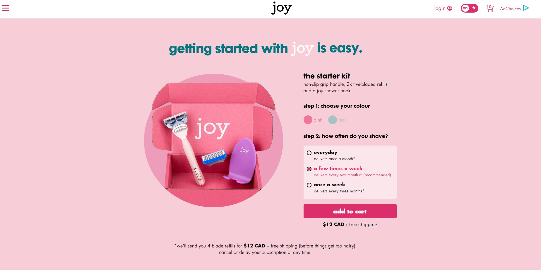
- The Power of Optimization: Small tweaks—such as changing a button from grey to red or shifting from "Submit" to "Get My Free Quote"—can have compounding effects on your ROI.
- The Shift Toward Value: Modern users are skeptical of ads. Your CTA must promise value (e.g., "Get the Guide") rather than just a transaction (e.g., "Buy").
Conclusion: Start Testing Today
The journey to the perfect call to action is continuous. There is no universal "golden phrase" that works for every audience; there is only what works for yours. Whether you are managing Facebook ad campaigns or optimizing a landing page for your startup, the path forward is data-driven.
Start by auditing your current assets. Are your buttons clickable? Is your language active? Are you using A/B testing to validate your choices? By applying the principles of urgency, clarity, and emotional resonance, you can transform your marketing from a passive broadcast into a high-converting conversation. The next click could be the one that defines your campaign’s success—ensure you’ve given your audience every reason to make it.