
In the contemporary digital landscape, the "desktop-first" mentality is no longer just a design oversight; it is a critical business failure. While ecommerce merchants spend thousands of hours refining their storefronts on high-resolution, 27-inch monitors, their actual customers are increasingly arriving via the chaotic, constrained, and high-pressure environment of a smartphone screen.
The disconnect between how store owners view their businesses and how shoppers experience them is driving a massive conversion gap. For the "cold" visitor—the shopper arriving via a TikTok scroll, an Instagram Reel, or an influencer’s ephemeral story—the brand loyalty that might forgive a clunky interface simply does not exist. They are ephemeral visitors, and if your mobile experience doesn’t captivate them in seconds, they will revert to the app they came from, leaving your cart abandoned and your marketing spend wasted.
The Reality of the "Cold" Visitor Experience
To understand the scope of the problem, one must adopt the perspective of the new user. Business owners often fail to see their own stores through the eyes of a stranger because their browsers are "warmed up"—filled with saved login credentials, cached cookies, and a pre-loaded cart history.
A new visitor, however, arrives in a vacuum. They have no saved information, no familiarity with your navigation, and zero patience for friction. If you want to witness the truth, open your store in an incognito window on a mobile device. What you will likely see is a chaotic barrage of requests for data, obscured content, and navigation elements that fight for dominance on a six-inch screen.
Chronology of a Failed Conversion
The typical journey of a frustrated mobile shopper follows a predictable, downward trajectory:
- The Click: The user clicks a link from a social media post, lured by a specific product.
- The Interruption: Before the product is even visible, a mandatory cookie consent banner—often poorly optimized—blocks the view.
- The Layered Barrier: As the user closes the cookie banner, an age-verification pop-up or a location selector appears.
- The "Email-Trap": Before the user has seen the value proposition, a "Join our Newsletter" pop-up obscures the entire screen, demanding an email address in exchange for a discount code they haven’t earned yet.
- The Disconnect: The user, now annoyed by three distinct layers of interface noise, attempts to scroll to find the product, only to find that a "sticky" header and a floating "add-to-cart" bar have consumed 40% of their vertical real estate.
- The Exit: Realizing the effort required to simply view a product image outweighs the desire for the item, the user hits the back button, returning to their social feed.
Supporting Data: The Friction Economy
The impact of mobile friction is not merely anecdotal; it is reflected in the widening gap between desktop and mobile conversion rates. Industry data consistently indicates that mobile conversion rates lag behind desktop by as much as 50% to 70%.

While the "Mobile Gap" is often blamed on the difficulty of entering payment information, the primary culprit is often the pre-checkout experience. According to recent usability studies, users who encounter an intrusive pop-up within the first five seconds of landing on a site are 35% more likely to bounce. Furthermore, when elements are stacked poorly—such as a sticky header, a promotional banner, and a chat widget—the remaining "active" area for product exploration is often reduced to less than 40% of the screen.
When you remove the address bar, the home icon, and the iPhone’s "Dynamic Island" from the equation, what looked perfect in a Figma prototype suddenly becomes a cluttered, unnavigable mess. Designers often build for a pristine, edge-to-edge canvas that does not exist in the real world.
The Technical Culprits of Mobile Abandonment
The "Pop-up" Pandemic
The obsession with lead generation has created a hostile mobile environment. While newsletters are essential for long-term retention, forcing a sign-up on a first-time visitor is a conversion killer. Merchants should adopt a "delayed-gratification" model: trigger pop-ups only after the user has demonstrated intent—such as scrolling 50% of the landing page or visiting a second page. A/B testing these timings is no longer optional; it is a fundamental requirement for modern ecommerce success.
The "Figma vs. Reality" Fallacy
Designers frequently fall in love with high-fidelity mockups that ignore the physical constraints of mobile hardware. A design that looks spacious on a desktop browser can look claustrophobic on a smartphone. Elements that are "pinned" to the top or bottom of a Figma screen often collide with the system-level interface of the mobile browser. Merchants must measure the "visible viewport"—the actual space left for content after the browser UI and site-sticky elements are accounted for. If your "Buy" button covers the ingredient list, you have failed the user.
Typography and the AI-First Trap
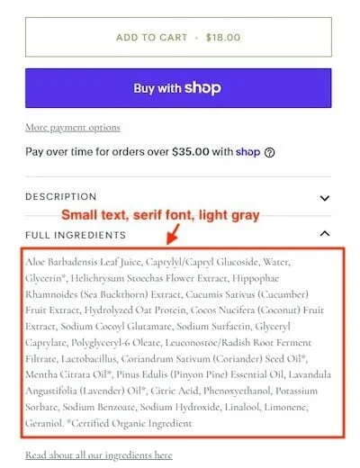
There is a growing trend of building product pages with the primary goal of being "AI-readable." By using tiny, light-gray serif fonts, merchants ensure that genAI platforms can scrape every detail of their product specifications. However, this comes at the cost of human readability. When a potential customer has to squint to read a sizing chart or an ingredient list, they don’t look for a magnifying glass—they look for a competitor. Prioritize human-centric design first; the AI bots will find a way to parse the data regardless of your font weight.
Implications: The "In-App" Browser Disparity
One of the most overlooked aspects of mobile commerce is that the majority of social traffic does not arrive via Chrome or Safari. It arrives through the in-app browser of Instagram, TikTok, or Facebook.

These environments are significantly more restrictive than native browsers. They often lack the sophisticated "autofill" capabilities that modern shoppers rely on for payment and shipping data. If your checkout process is not optimized for these specific in-app environments, your "optimized" mobile store may effectively break. Scripts may fail to load, layouts may shift unexpectedly, and the seamless checkout experience you tested on Safari will evaporate, leaving the user staring at a broken form.
The Future of Interaction: Fingers, Not Cursors
The shift from cursor to touch-screen interaction is the most significant UX change in the last two decades. Many ecommerce sites still treat mobile images as static assets, ignoring the user’s need to "touch" the product.
When a shopper views a garment, they want to see the weave of the fabric, the quality of the stitching, and the texture of the material. If you disable pinch-to-zoom, or if your images are fixed at a low resolution, you are effectively hiding the product. This lack of visual detail is frequently misinterpreted by merchants as a "pricing issue" or a "lack of brand trust." In reality, it is a visual accessibility issue. If a user cannot inspect the product as closely as they would in a physical store, they will not commit to the purchase.
Conclusion: The Path Forward
To thrive in this new era of commerce, merchants must shift their focus from "Desktop-First" to "Mobile-Obsessed." This means:
- Auditing the In-App Experience: Testing your store inside the Instagram and TikTok browsers, not just on your desktop emulator.
- Prioritizing Readability: Ensuring that font sizes, color contrasts, and spacing are legible for humans, even if it makes the page slightly less "minimalist."
- Removing Friction: Delaying lead-gen pop-ups and ensuring that the navigation is as intuitive as a physical store aisle.
- Enabling Interaction: Making sure images are fully interactive, allowing users to zoom, rotate, and inspect products as they would with their own hands.
The goal is to transform the mobile store from a digital pamphlet into a frictionless sales engine. By acknowledging the constraints of the mobile environment and designing for the "cold" visitor, merchants can turn the high-intent traffic of social media into long-term customer loyalty. The screen is small, but the opportunity is immense—provided you clear the way for the customer to see it.