
In the modern B2B landscape, the traditional "versus" page is dying. For years, the standard playbook for SaaS marketers has been to pit their product against a competitor in a rigid, one-to-one matchup, complete with a feature table meticulously curated to make their solution look like the only logical choice.
However, today’s B2B buyers are more informed, more skeptical, and far less patient with biased sales pitches. With tighter budgets and increased scrutiny on every software procurement decision, buyers aren’t looking for a cheerleader—they are looking for a consultant.
If your comparison pages feel engineered to "win" an argument rather than solve a problem, you are likely alienating your most qualified prospects. According to landing page expert Tas Bober, the most effective comparison pages are those that prioritize integrity, helping the right buyers evaluate their true options—including manual workarounds and the status quo.
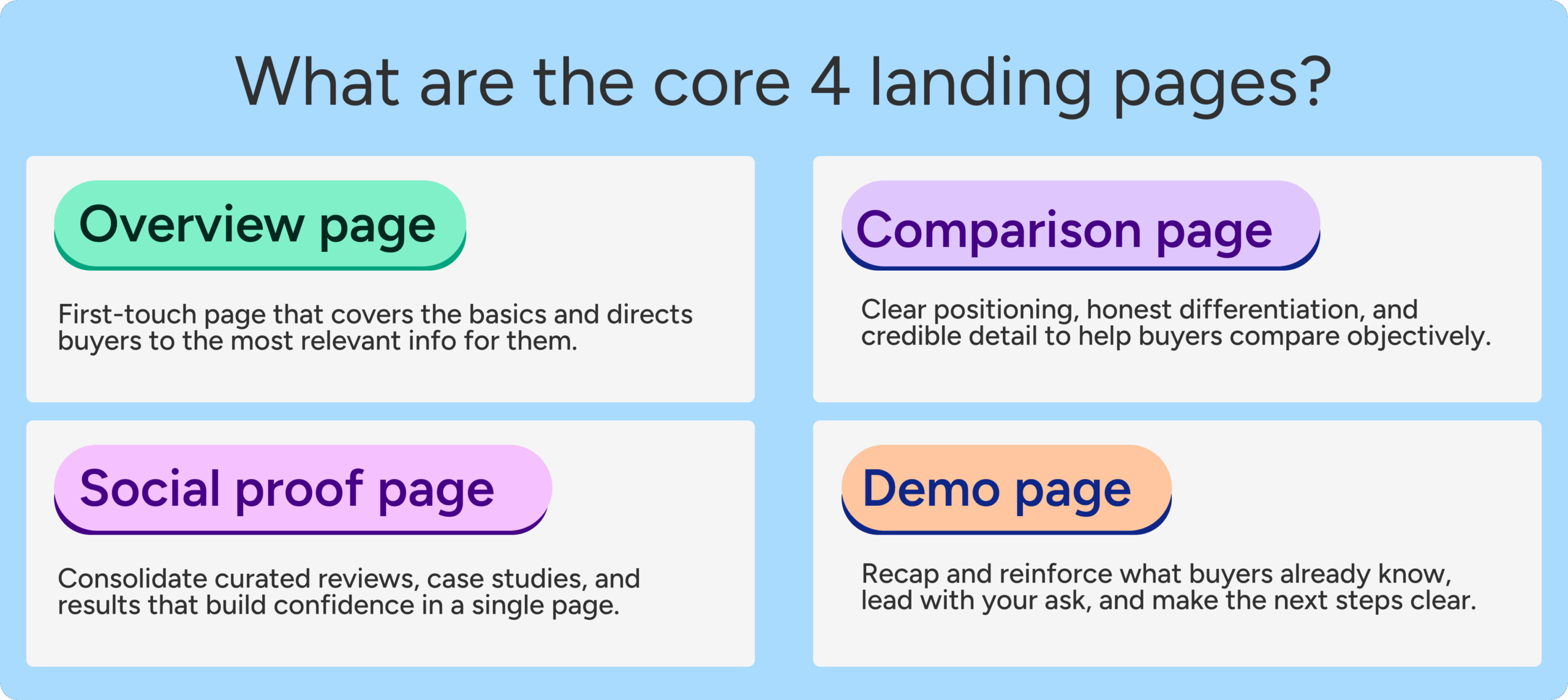
The Evolution of the Comparison Page
A SaaS comparison page is no longer just an SEO checklist item designed to capture high-intent search traffic. It is a critical touchpoint in the buyer’s journey. Harvard Business Review reports that 40% to 60% of B2B deals are lost not to a competitor, but to "no decision"—the buyer decides to stick with their current manual process or an existing, inadequate workaround.
This is where the paradigm shifts. A truly effective comparison page doesn’t just argue why your product is better than a direct competitor; it frames the entire category, explains the trade-offs of various approaches, and guides the buyer toward a confident, informed decision.

Anatomy of a Trust-First Comparison Page
To build a page that resonates, you must move beyond the "takedown" mentality. Tas Bober’s framework for a high-converting comparison page focuses on utility, transparency, and logical flow.
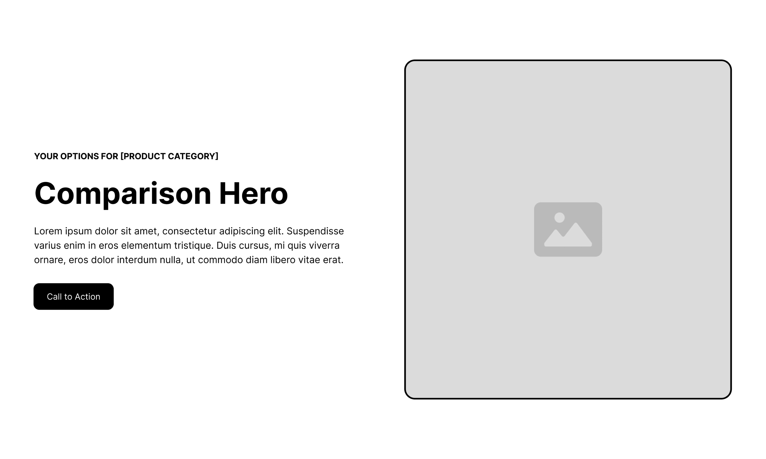
1. The Strategic Hero Section
Your hero section should immediately confirm the visitor’s intent. Instead of a vague claim, use an "eyebrow" label to confirm the search term they used (e.g., "Your options for project management software"). The headline should frame the decision in terms of the buyer’s goals, not your product’s features.
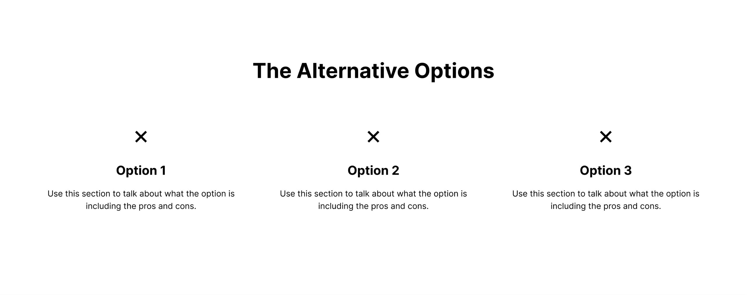
2. Providing Context with Alternatives
Before diving into a head-to-head comparison, provide a broader view. Help the buyer understand the landscape:
- The Status Quo: Acknowledge manual workarounds (spreadsheets, email threads).
- The Market Leaders: Position the primary category players.
- The Niche Alternatives: Highlight specialized solutions for specific use cases.
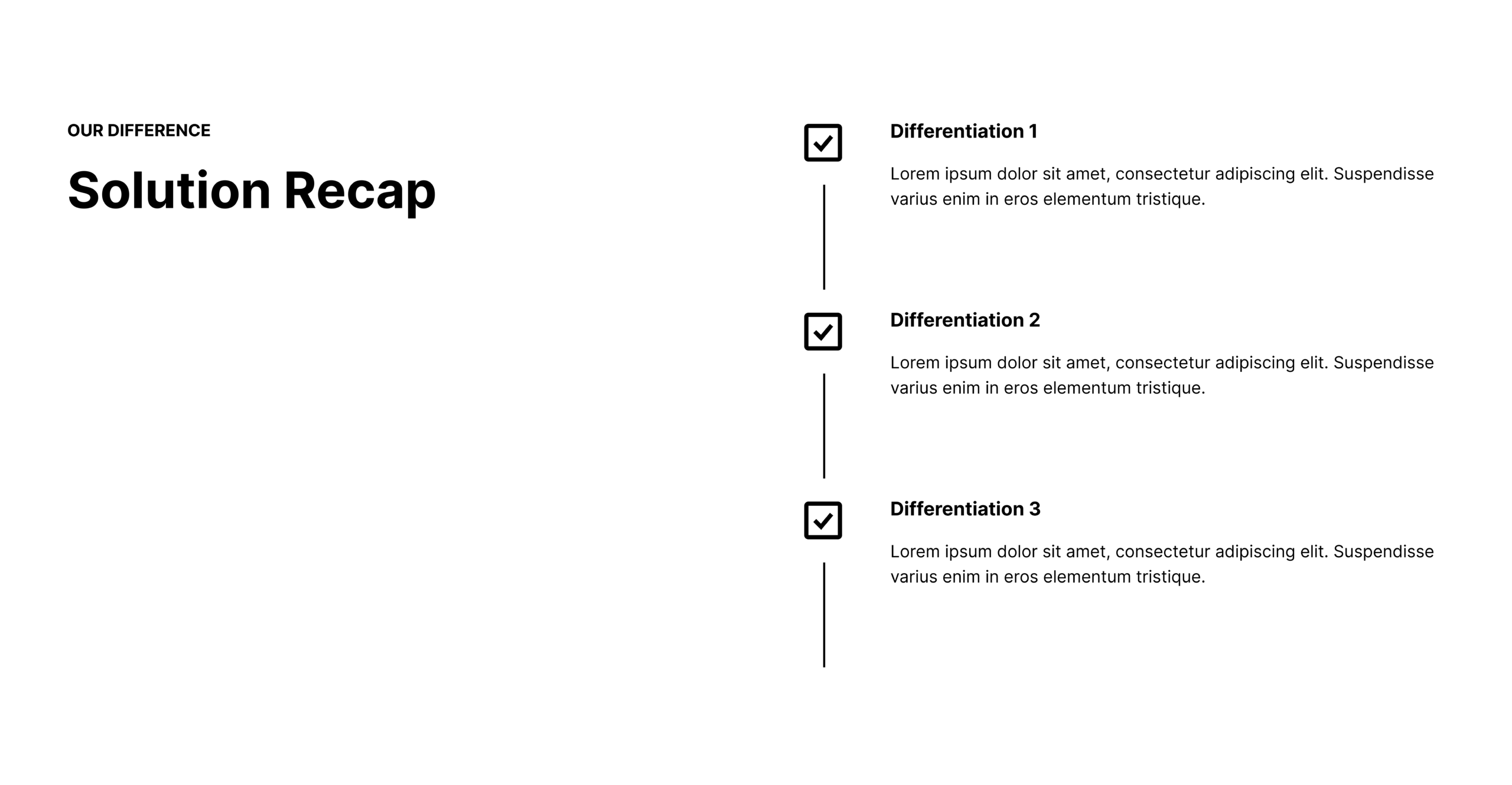
3. The "Why" Behind Differentiation
Once you have established the landscape, pivot to your solution. Use this section to highlight your unique value proposition. What is the one thing your product does that the others do not? Focus on the trade-offs. Be honest about what your product isn’t designed for; this level of radical transparency builds immediate trust.

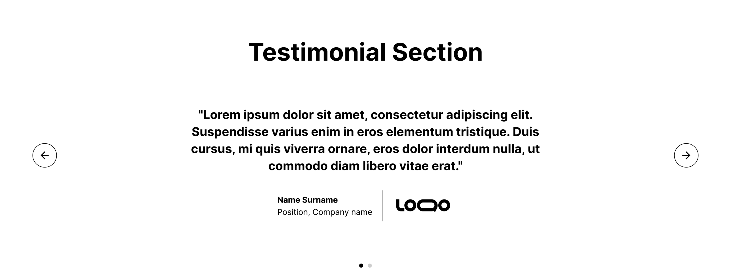
4. The Role of Proof (Testimonials and Results)
Generic testimonials are easily ignored. Instead, use "migration stories." Highlight quotes from customers who specifically switched from the competitors you have listed on the page. Quantify their success: "Company X reduced reporting time by 40% after switching from [Competitor] to our platform."
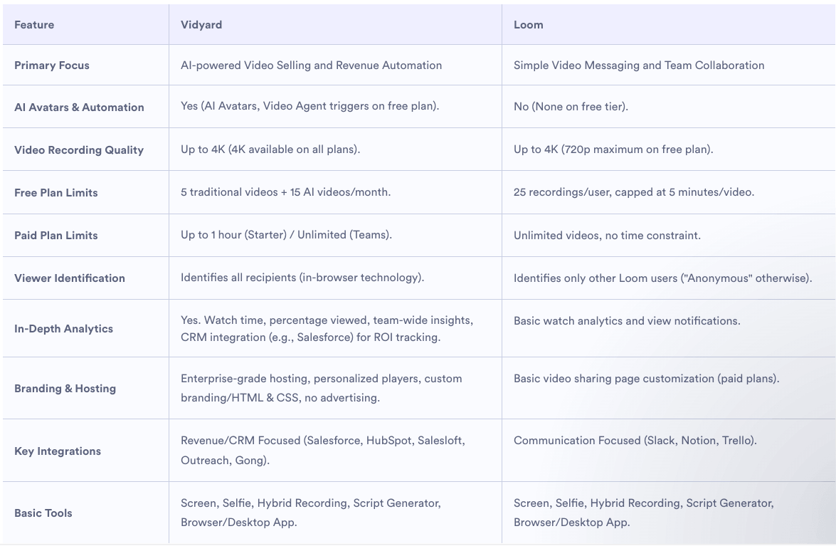
Why Traditional Feature Tables Often Fail
You might notice a conspicuous absence in modern, high-performing templates: the traditional "check-mark" feature table.
While common, these tables are often criticized for being misleading. They fail to account for the quality or usability of a feature. A checkmark for "Reporting" doesn’t tell a buyer if that reporting is intuitive, automated, or robust. When you omit the nuances of how a feature actually performs in the real world, you signal to the buyer that you are hiding the truth. Instead, focus on thematic comparisons—such as "Ease of Implementation," "Scalability," or "Integration Depth"—that provide actual decision-making value.
Real-World Examples of Integrity-Driven Pages
Several companies are successfully pivoting to this "honest guide" approach:
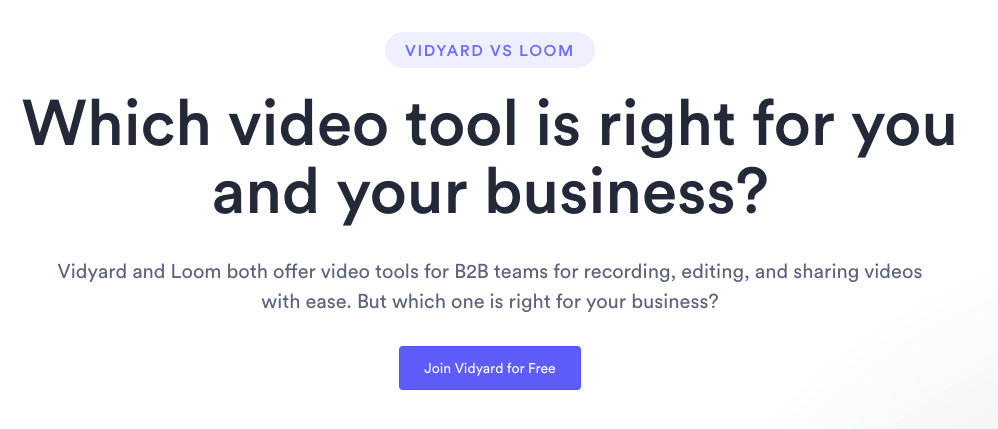
- Vidyard vs. Loom: Their comparison page starts with a direct, user-centric question: "Which video tool is right for you and your business?" It frames the comparison as a service to the buyer rather than a demand for a sale.
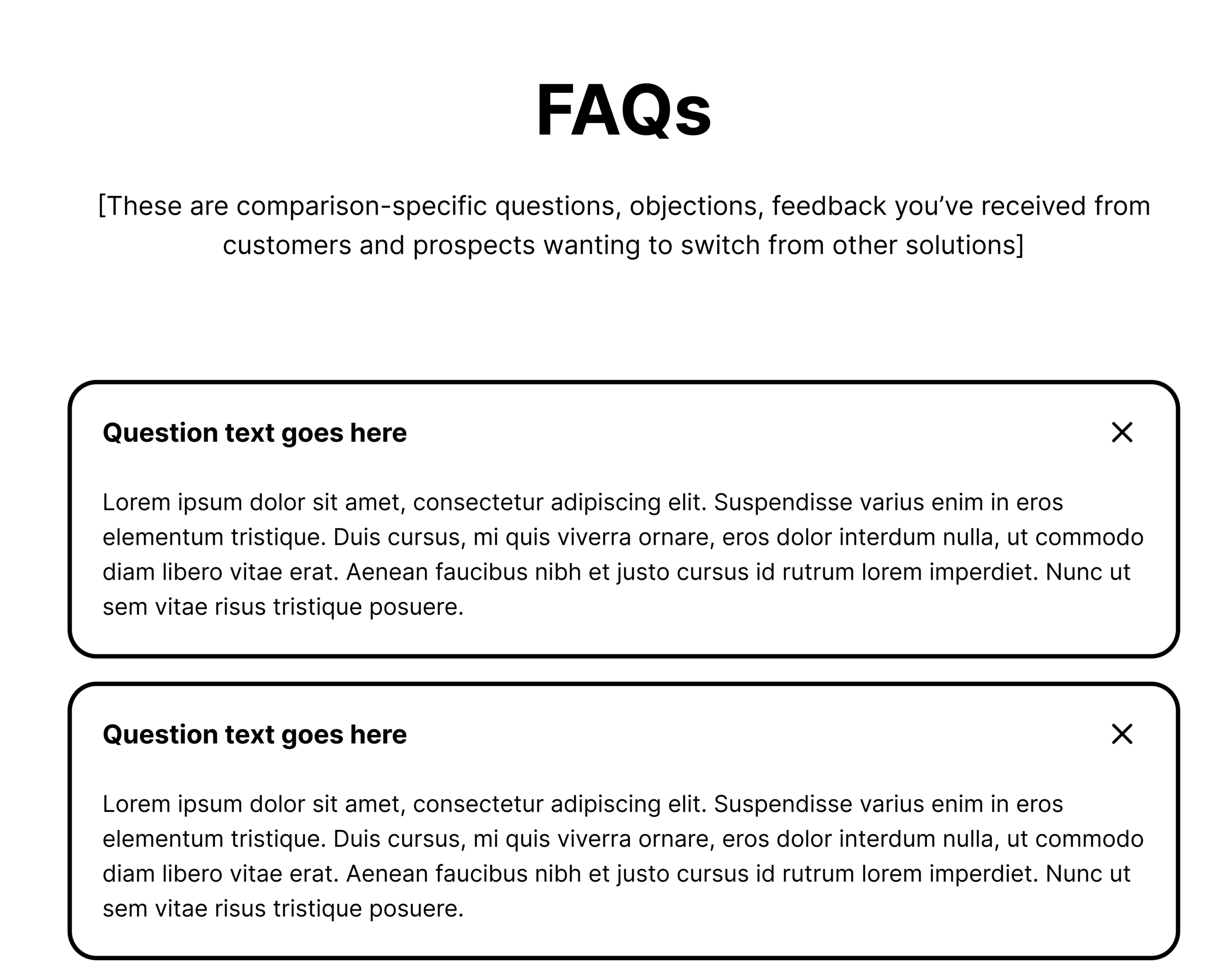
- Asana vs. ClickUp: Asana excels by leaning into the "migration" anxiety. Their FAQ section directly addresses the pain points of switching platforms, such as data migration and team onboarding, which are the real barriers to purchase.
- Mailchimp vs. Klaviyo: Mailchimp provides a masterclass in transparency. They don’t shy away from their own limitations, clearly articulating when a competitor might be the better fit. This honesty disarms the buyer and makes the subsequent pitch for their own platform significantly more credible.
Implications for Your Marketing Strategy
If you want to build comparison pages that actually drive pipeline, you must change how you view these assets.
- Prioritize Search Intent: Ensure your page structure matches what the user is actually looking for. If they are looking for a "replacement," your content should focus on migration ease. If they are in the "discovery" phase, focus on the pros and cons of different approaches.
- Align with Sales: Your sales team knows exactly why they lose deals. Use that intelligence to fuel your comparison content. If you consistently lose to a specific feature, address it head-on with a nuanced explanation of your product’s philosophy.
- Optimize for Trust: Use clear, navigation-based anchors so users can find exactly what they need. Avoid "dead-end" pages. If a user concludes your product isn’t for them, provide a link to a helpful resource or a different category page so you remain a trusted advisor.
Conclusion: The Path Forward
The era of the "biased feature list" is coming to an end. Today’s B2B buyers have access to an abundance of information, and they are adept at sniffing out marketing fluff. By building comparison pages that act as a guide rather than a salesperson, you differentiate your brand as one that is confident enough to be honest.
Whether you are comparing yourself to a legacy competitor, a scrappy startup, or a manual process, your goal remains the same: to reduce the friction of decision-making. When you help a buyer make the right choice—even if that choice is sometimes not you—you build a reputation that eventually wins the market.
Start by auditing your current comparison pages. Ask yourself: "Is this page actually helpful to a buyer, or is it just trying to trick them into clicking a button?" If the answer is the latter, it’s time to rebuild with integrity.