For many SaaS marketing teams, the "Request a Demo" page is the graveyard of high-intent leads. When demo volume dips, the knee-jerk reaction is to blame the landing page: maybe the headline is too dry, the form is too long, or the color of the CTA button isn’t bold enough. However, according to recent industry insights from B2B marketing experts, these micro-optimizations are often just cosmetic bandages on a much deeper, structural wound.
The core issue isn’t the page itself; it is a fundamental misunderstanding of where the buyer stands in their 211-day average journey. When companies force cold, uneducated traffic toward a high-friction "Request a Demo" CTA, they aren’t just losing conversions—they are actively damaging their brand’s credibility.
The Anatomy of the Buyer Journey: Why "Request a Demo" Isn’t a Low-Friction Ask
In the world of B2B SaaS, a "Request a Demo" call-to-action is not the same as offering a free trial or a whitepaper download. It is an invitation to enter a high-pressure sales conversation. According to Dreamdata’s 2025 LinkedIn Ads Benchmark Report, the average B2B buyer journey encompasses 88 distinct touchpoints and spans over 200 days.
When a marketer treats a demo request as a "low-friction" action, they are ignoring the psychological reality of the buyer. A potential customer needs to have already identified their pain point, researched alternatives, and built a baseline of trust in your solution before they are willing to open their calendar to a sales representative. If your demo page is the first place a prospect sees your brand, you are essentially asking for a marriage proposal on a first date.
The "Core Four" Framework
Landing page expert Tas Bober has pioneered the "Core Four" framework to address this disconnect. The theory is simple: the demo landing page should be the final destination, not the starting line. By the time a prospect arrives at your demo page, they should have already navigated the top-of-funnel (TOFU) research phase. Your demo page isn’t there to educate them on "what you do"—it is there to confirm that "you are the right choice."
Chronology of a High-Converting Demo Page
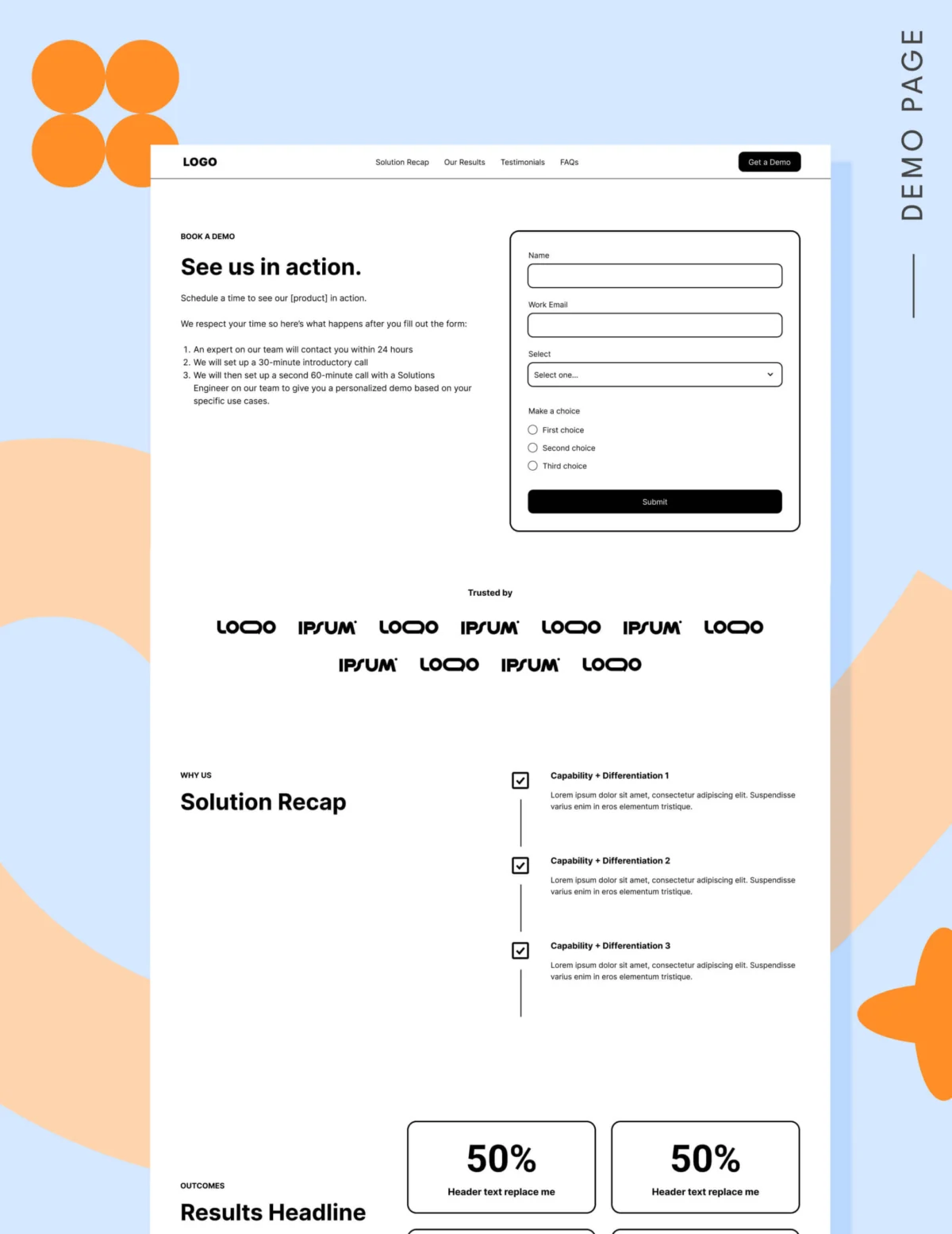
To optimize your demo page, you must think in terms of sequential reassurance. A prospect lands on your page with specific anxieties: Will this be a waste of time? Will I be pressured into a sale? Does this actually fit my specific use case?
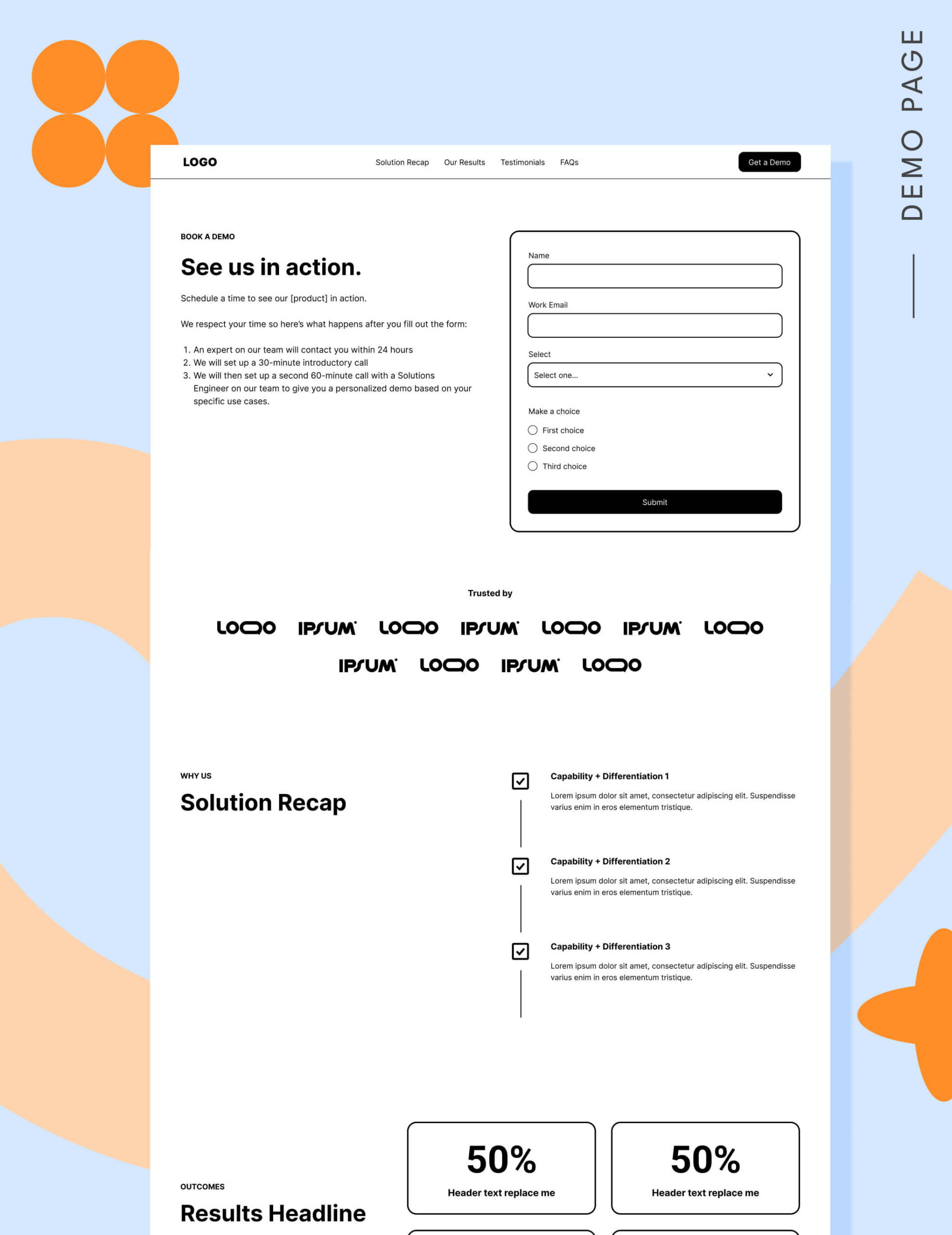
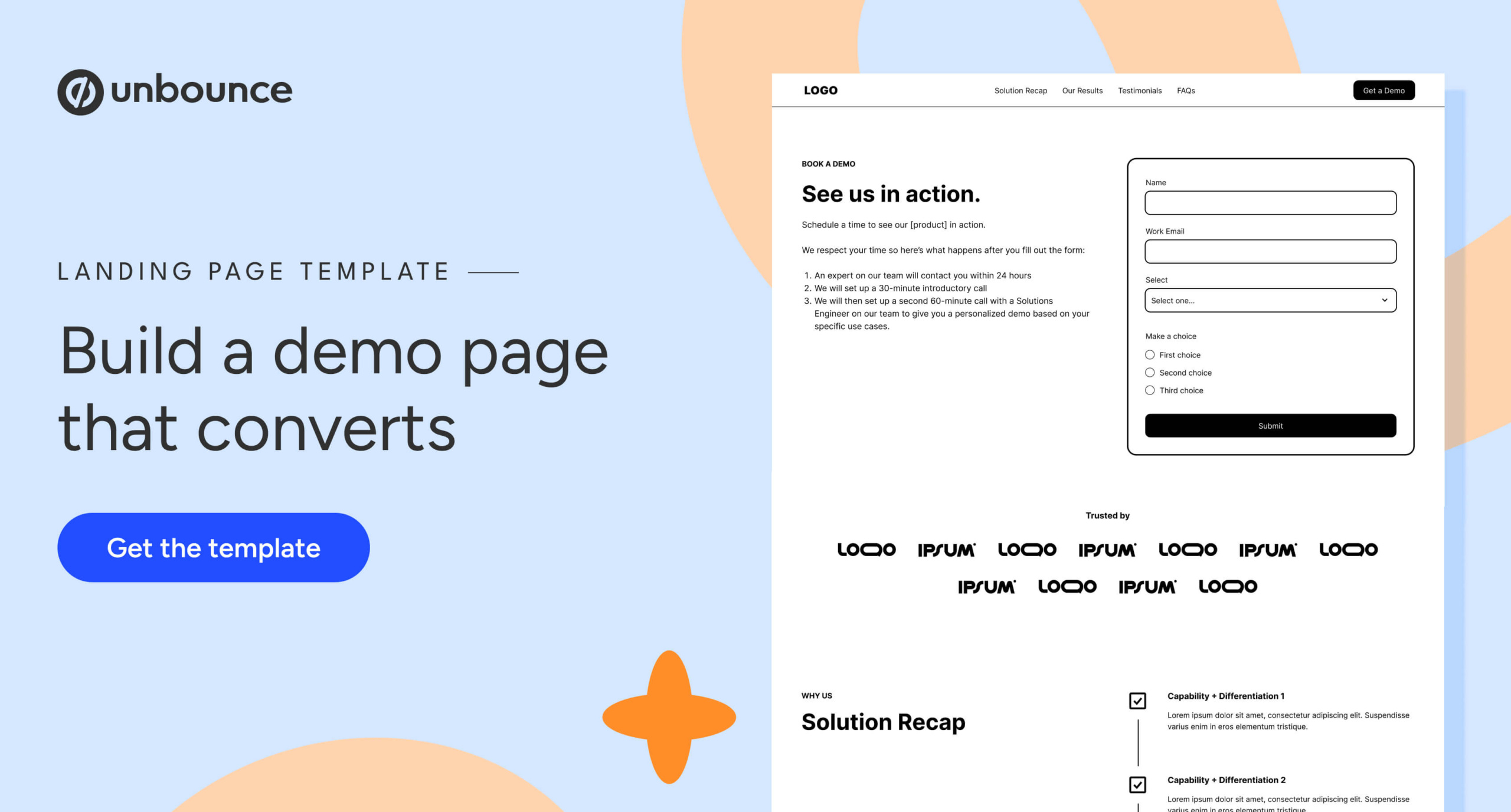
- The Hero (Setting Expectations): This is the one place where a form is appropriate above the fold. However, the copy must explicitly state what happens after the click. Does a human reach out? Is it an automated scheduler? Transparency reduces the "cold call" anxiety.
- The Credibility Layer (Logo Gardens & Social Proof): If your prospects recognize your current clients, a logo garden is essential. If they don’t, prioritize high-impact testimonials that specifically mention ROI or ease of implementation.
- The Solution Recap: Don’t assume they remember your value proposition. Use this space to reinforce your top three differentiators—why you, and why now?
- The Results Section: Move from vague promises to quantifiable data. "Improved workflow" is weak; "Reduced lead processing time by 40%" is compelling.
- The FAQ: This is your final chance to handle common objections—pricing ranges, implementation timelines, and security concerns.
Supporting Data and Benchmarks
Industry standards for demo page conversion rates have stabilized in the low single digits. Unbounce’s 2024 Conversion Benchmark Report, supported by 2026 data from industry experts like Tas Bober, suggests that a 3% to 4% conversion rate is a healthy, realistic benchmark for a B2B SaaS demo page.
When you look at form performance, the data is even more rigid. Research from 2026 shows a sharp cliff in conversion rates once a form exceeds five fields. Companies that push for excessive lead qualification data upfront often see conversion rates plummet below 7%. The key is to balance the need for CRM data with the reality of user friction.
Conversion Efficiency by Form Length:
- 3-5 Fields: ~17% conversion rate (The "sweet spot").
- 7 Fields: ~11% conversion rate.
- 10+ Fields: <7% conversion rate.
Strategic Implications of Transparency
One of the most debated topics in modern B2B strategy is the inclusion of pricing on a demo landing page. While many sales-led organizations fear that showing pricing will scare off leads, the data suggests the opposite. Displaying a starting range (e.g., "Plans starting at $X/month") or a condensed pricing grid acts as a powerful self-qualification filter.

By showing pricing, you aren’t losing leads; you are filtering out "tire-kickers" who would never have bought your product anyway. This saves your sales team from hours of unproductive discovery calls and ensures they spend their time with high-intent prospects who have already cleared the budget hurdle.
Official Guidance: How to Fix the "Lead Quality" Problem
If your sales team is complaining about lead quality, the problem almost certainly originates in your traffic acquisition strategy. Sending cold traffic—prospects who haven’t yet engaged with your content or brand—directly to a demo page is a recipe for low conversion and high churn.
Recommended Traffic Sources for Demo Pages:
- Retargeting: Users who have already visited your pricing or product pages.
- Bottom-of-funnel (BOFU) Search: Keywords like "alternative to [Competitor]" or "[Product Category] pricing."
- Email Nurture Campaigns: Leads who have engaged with multiple whitepapers or webinar recordings.
Traffic to Avoid:
- Broad Interest-Based Social Ads: These users are in discovery mode, not buying mode.
- Generic "Top of Funnel" Keywords: Targeting broad terms like "SaaS software" will bring traffic that is far too early in their journey to book a demo.
Conclusion: A Shift in Mindset
To improve your demo request volume, you must stop viewing the landing page as a conversion funnel and start viewing it as a trust-building exercise. If you fix your targeting first—ensuring only warm, informed prospects reach the page—you will find that the page itself requires very little "optimization."
When you provide the right information to the right person at the right time, the "Request a Demo" button stops being a hurdle and starts being the natural, logical conclusion of a well-informed buyer’s journey. Before you test your next CTA button color, audit your traffic source. If the visitor isn’t ready to buy, no amount of design wizardry will convince them to book a meeting.