In the digital landscape, the difference between a high-performing marketing campaign and a total budget sinkhole often comes down to a single, focused web page: the landing page. While the principles of digital advertising have evolved, the core mandate of the landing page remains immutable. As the authors at Unbounce—Luke Bailey, Colin Loughran, and Paul Park—aptly note, a polished, professional landing page is the primary driver of conversion rates, whereas a cluttered or confusing one can dismantle even the most well-funded ad campaign.
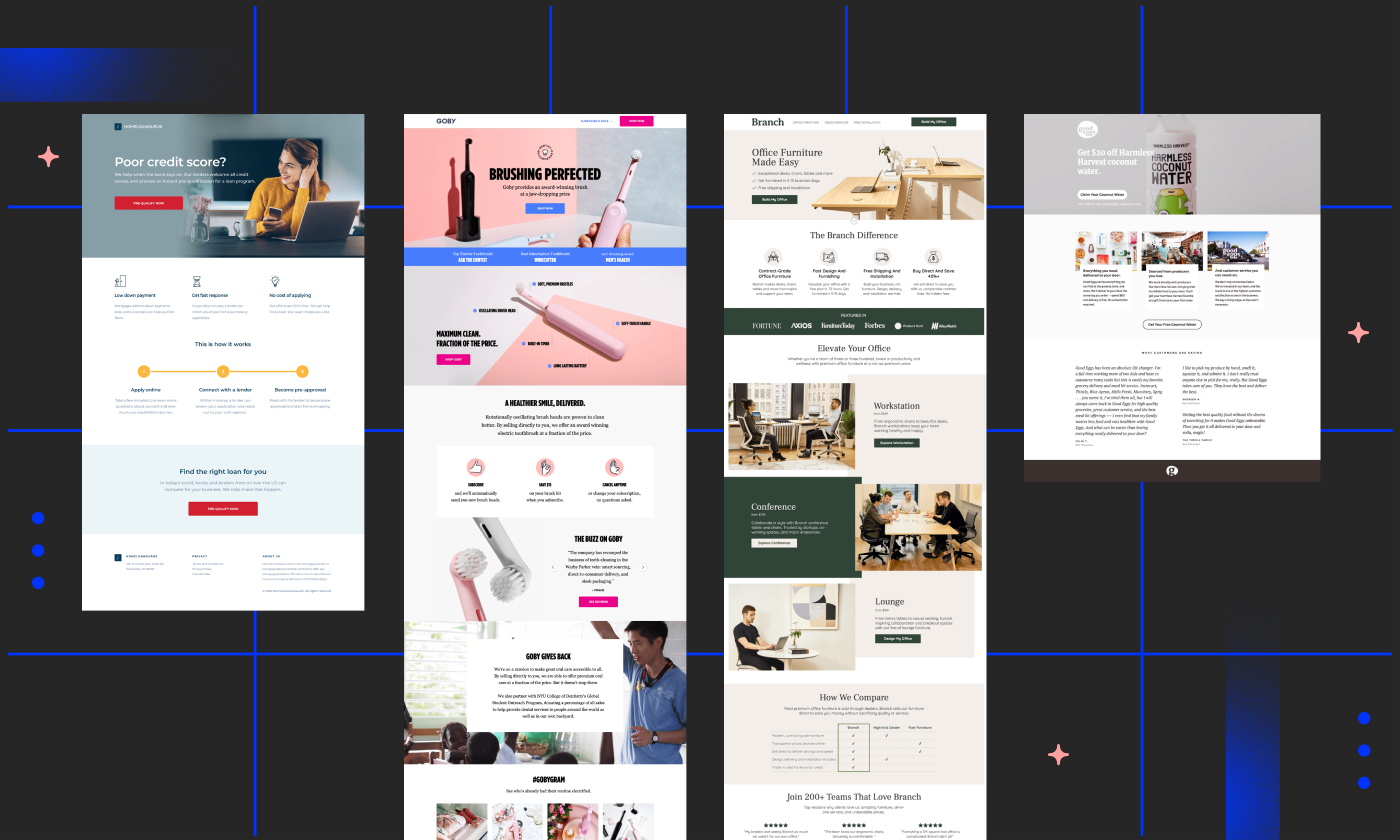
But what truly separates a "good" page from an elite, high-converting one? To answer this, we must deconstruct the elements of success across various industries, from SaaS and e-commerce to professional services and education.

The Foundation: What Is a Landing Page?
At its most fundamental level, a landing page is a standalone destination created specifically for a marketing or advertising campaign. Unlike a homepage, which serves as a navigational hub for a brand, a landing page is designed with a singular, laser-focused objective: to convert a visitor into a lead or a customer.
When a user clicks on an ad, an email link, or a social media post, the "landing" experience must be seamless. It must address the user’s intent immediately, remove friction, and guide them toward a definitive action. Whether that action is signing up for a newsletter, downloading an e-book, or purchasing a product, the landing page acts as the bridge between interest and action.
Chronology of Conversion: The Evolution of Design
Over the last decade, landing page design has transitioned from keyword-stuffed walls of text to sophisticated, benefit-driven narratives.

- Early Era (Pre-2015): Pages were often static, text-heavy, and focused on SEO gaming rather than user experience.
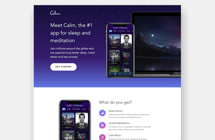
- The Rise of SaaS (2015–2019): Companies like Netflix and LinkedIn set the standard for "minimalist" design, utilizing clean, high-contrast layouts to highlight value propositions.
- The Modern Era (2020–Present): Today’s elite pages prioritize mobile responsiveness, video integration, and social proof. Agencies like J7 Media, ConversionLab, and MuteSix have popularized the "storytelling" approach, where the visitor is taken on a psychological journey that mirrors the customer sales funnel.
Supporting Data: Why Design Matters
The numbers speak for themselves. The conversion rate of a landing page is directly correlated to its ability to reduce cognitive load.

Research indicates that landing pages featuring video can increase conversion rates by as much as 86%. This is not merely an aesthetic choice; it is a functional one. Video allows a brand to convey complex value propositions in seconds—a task that might require paragraphs of text.

Furthermore, consistency is key. When the messaging on an advertisement matches the headline of the landing page, the "scent" of the campaign remains intact, reducing bounce rates. Data-driven marketers now focus heavily on "Above the Fold" content—the section visible before a user scrolls—ensuring that the most vital information and the primary Call to Action (CTA) are immediately accessible.

Industry Benchmarks: 40 Examples of Excellence
The following examples demonstrate how diverse sectors utilize specific design triggers to drive results:

1. The Power of Simplicity (Netflix & Spotify)
Both platforms understand that their brand is universally recognized. They don’t waste real estate explaining what they are. Instead, they focus on the immediate desire: "start streaming." By removing all navigational distractions, they ensure the only path forward is the one leading to a subscription.

2. The Power of Storytelling (Grass Roots & Bariatric Eating)
These brands use their landing pages to educate. Grass Roots, for example, guides the user from problem awareness (why grass-fed is better) to the solution (the cooperative’s meat products), creating an emotional connection that converts curiosity into a purchase. Bariatric Eating’s page—which boasts an impressive 39% conversion rate—proves that injecting personality into a clinical subject can significantly boost engagement.

3. The Power of Trust (HomeLoanGurus & Panda7)
In industries like finance and insurance, where the barrier to entry is high due to user anxiety, these brands use simple, jargon-free copy to build trust. By highlighting that they work with users regardless of credit score, they remove the primary psychological friction point that usually causes users to abandon the page.

4. The Power of Visuals (Mooala & Woolx)
Mooala, known for its banana milk, utilizes a playful, mascot-led design that reflects the brand’s identity. Similarly, Woolx uses high-definition video backgrounds to emphasize the texture and quality of their clothing, allowing the user to "experience" the product through the screen.

Official Perspectives: The Expert View
Cameron Gawley, CEO of BuzzShift, emphasizes that landing pages should be viewed through the lens of the "consideration phase." According to Gawley, the goal isn’t always an immediate sale. "Most brands have a huge opportunity to lower their CPA and increase conversions by focusing more on awareness and consideration," he notes.
This perspective shifts the goal of the landing page from a "hard sell" to a "soft conversion"—such as capturing an email for a future nurturing sequence. This is a critical takeaway for businesses with longer sales cycles.
Implications for Your Business: How to Start
If you are looking to replicate this success, you do not need to be a developer. The modern marketer relies on drag-and-drop builders, which allow for rapid A/B testing.
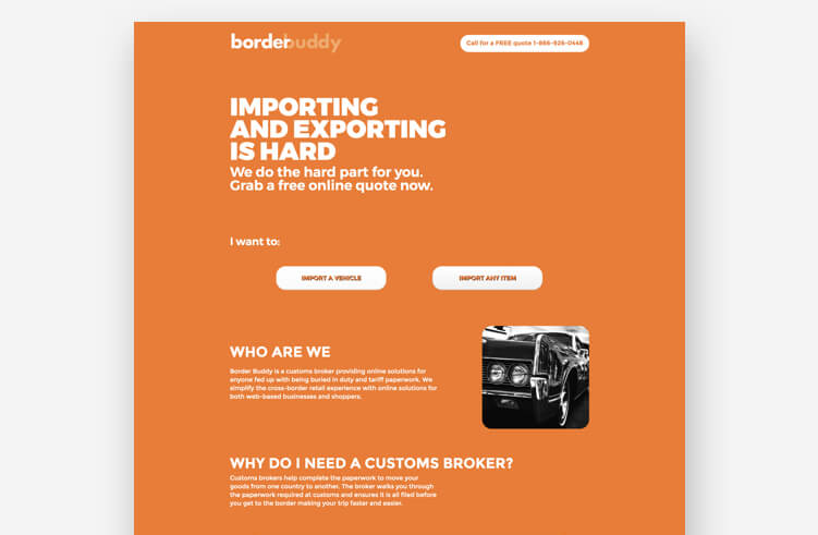
The 10-Step Path to a High-Converting Page:
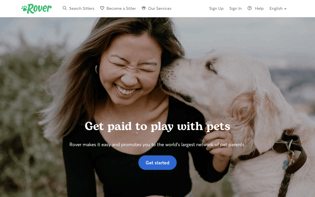
- Define your goal: Do you want a lead or a sale?
- Target the audience: What is their primary pain point?
- Draft a headline: It must match your ad copy.
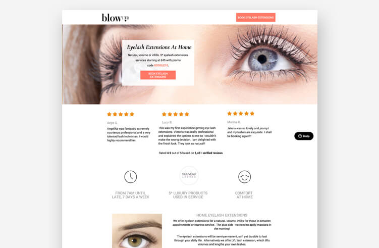
- Create a hero shot: Use imagery that reflects the outcome.
- Simplify the copy: Focus on benefits, not features.
- Add social proof: Use testimonials or logos.
- Optimize the CTA: Make it stand out and use active language.
- Minimize the form: Only ask for what is absolutely necessary.
- Ensure mobile speed: A slow page is a dead page.
- A/B Test: Never assume the first version is the best version.
Conclusion: The "Michael Jordan" Mentality
It is easy to look at the landing pages of global giants like Amazon or Netflix and feel intimidated. However, it is vital to remember that these pages did not start as masterpieces. They started as blank pages, a brand identity, and a big idea.

The most successful marketers treat their landing pages as living, breathing experiments. They test headlines, swap images, and refine their calls to action based on real-time data. By adopting a "test-and-iterate" mindset, you can evolve your pages into high-converting assets that not only capture attention but drive the bottom-line growth your business requires. The tools exist; the frameworks are documented. All that remains is the execution.