
In the high-stakes world of digital commerce, the difference between a completed sale and an abandoned cart often boils down to a single, fleeting moment of confusion. For over two decades, Steve Krug’s seminal work, Don’t Make Me Think, has served as the definitive manifesto for user-interface design. Krug’s core thesis is simple yet profound: every time a shopper has to pause to ask, "Where do I click?" or "What does this mean?", the store loses a portion of the shopper’s finite reservoir of goodwill.
When a customer arrives at your storefront, they are looking for a path of least resistance. If your interface forces them to perform mental gymnastics—deciphering obscure labels, calculating unit prices, or guessing at pack sizes—you are not just creating a hurdle; you are actively encouraging them to leave. To maximize conversions, modern e-commerce leaders are removing these cognitive taxes by embracing intuitive design, visual cues, and outcome-based messaging.
Main Facts: The Psychology of Hesitation
The psychology of the "hesitation point" is rooted in cognitive load theory. Human beings are hardwired to seek efficiency. When a shopper encounters a complex interface, the brain must switch from a "buying" state to a "problem-solving" state. This transition is fatal to the sales process.

Each moment spent decoding an interface drains the user’s motivation. If a shopper must calculate how many ounces are in a case, or translate "12-pack" into "how long this will last," they are essentially doing work they did not sign up for. When the effort of understanding the product exceeds the perceived value of the product itself, the shopper closes the tab. The goal of a world-class e-commerce experience is to make the product selection so obvious that the customer feels they are making a natural choice, rather than solving a puzzle.
Chronology of UI Evolution
The evolution of e-commerce design has moved from information-dense, catalog-style layouts to streamlined, purpose-driven experiences.
- The Early Web (1995–2005): Interfaces were built to mirror physical catalogs. The priority was listing specifications, SKU numbers, and raw technical data. Users were expected to perform the mental heavy lifting.
- The "Conversion Optimization" Era (2006–2015): With the rise of A/B testing, retailers began to understand that fewer distractions equaled higher sales. This saw the removal of unnecessary navigation links on checkout pages and the birth of the "single-page checkout."
- The Cognitive Ease Era (2016–Present): Today’s leaders, such as Gush, Waju, and The Farmer’s Dog, are moving beyond simple layout optimization. They are focusing on semantic clarity—ensuring the language of the product matches the language of the user’s life.
Supporting Data and Real-World Implementation
To eliminate the need for the customer to "do the math," several brands have revolutionized their product pages by translating technical specs into lifestyle outcomes.
1. Removing the Math: The Gush Approach
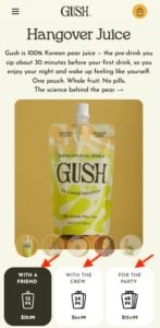
Gush, a beverage brand, effectively removes calculation fatigue by labeling pack sizes based on social occasions: "With a Friend," "With the Crew," and "For the Party." By aligning the product quantity with the user’s intent, Gush bypasses the need for the shopper to count units or estimate how much is "enough." The shopper isn’t buying a 12-pack or a 24-pack; they are buying the experience of their upcoming night.
2. Visual Transparency: The Waju Method
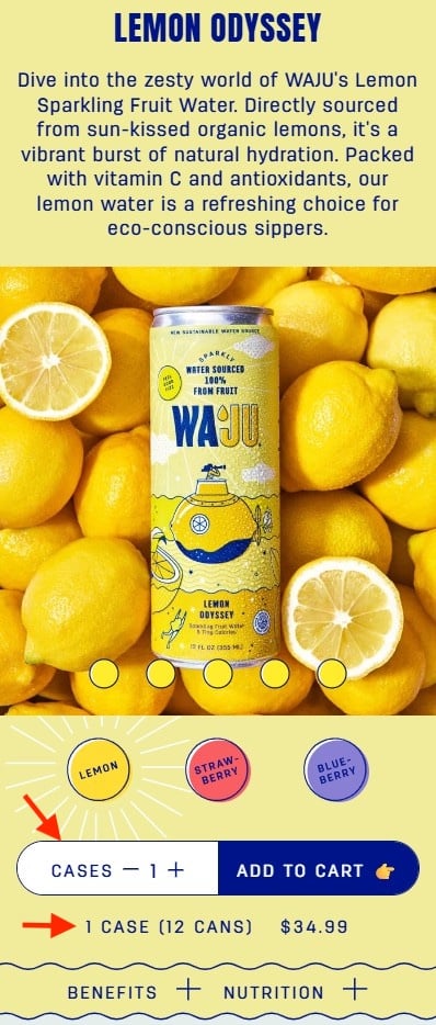
Clarity in quantities is a common failure point. Waju solves this by explicitly labeling their units as "Cases" while providing a secondary, highly visible line of text: "1 case (12 cans)." By placing this information directly under the quantity selector and using high-contrast design, they ensure the shopper never has to guess what they are adding to their cart.
3. Outcome-Oriented Naming: Blueland
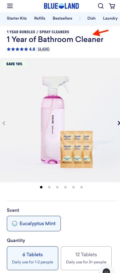
Blueland takes the "Don’t Make Me Think" philosophy to its logical conclusion by focusing on the outcome rather than the contents. Instead of selling a "Refill Kit (6 Tablets)," they market "1 Year of Bathroom Cleaner." This shifts the focus from the granular details (tablets) to the value proposition (a year of cleaning). It empowers the user to choose based on their household needs rather than their ability to calculate the longevity of a chemical tablet.
4. Portion Illustration: The Farmer’s Dog
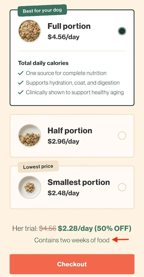
Perhaps the most sophisticated example is The Farmer’s Dog. They address the "how much do I need?" question by using three visual bowls. By pricing the product per day rather than per box, they align the cost with the user’s existing mental model of pet care. The addition of the clarifying sentence, "Contains two weeks of food," removes the final barrier to entry: uncertainty.
Official Perspectives and Expert Consensus
UX researchers and behavioral economists generally agree that "cognitive friction" is the silent killer of revenue. According to experts, the "Reservoir of Goodwill" theory holds that every user starts a session with a certain amount of patience. Every technical error, every confusing label, and every hidden cost chips away at that reservoir.
Industry leaders emphasize that transparency regarding shipping and total pricing is not just a customer service gesture—it is a conversion tool. When a site fails to be upfront, they force the user to navigate to a shipping policy page or proceed deep into the checkout flow just to find a price. This is a classic "Don’t Make Me Think" violation. The consensus is clear: if you can answer a user’s question before they have to ask it, you have already won half the battle.
Implications for Future E-commerce
The implications for retailers are clear: the future of e-commerce lies in "anticipatory design." To remain competitive, brands must audit their product pages for "points of friction."
Key Takeaways for Retailers:
- Audit for Math: Identify any place where a customer has to perform a calculation (conversions, division, or multiplication). Replace these with lifestyle or outcome labels.
- Visual Validation: Do not rely on text alone. If you are selling by the case, show the case. If you are selling by the portion, show the bowl.
- Name for the Benefit: When possible, name your bundles based on what the user gets out of them (e.g., "A Month’s Supply" vs. "30-count container").
- Consistent Cues: Ensure that your most important information—shipping, quantity, and total price—is visible at a glance without scrolling or clicking.
As artificial intelligence and machine learning become more prevalent, the expectation for a personalized, frictionless experience will only grow. Shoppers will increasingly gravitate toward platforms that understand their needs intuitively. Retailers who force their customers to "think" will find themselves being bypassed by those who provide the right answers before the question is even fully formed in the shopper’s mind.
Ultimately, the goal of design is to become invisible. When the interface disappears, the focus remains entirely on the product and the value it brings to the customer. By removing the obstacles of calculation and ambiguity, you allow the shopper to do what they came to your site to do: buy.